Chained Select Progressive Enhancement
Perhaps you have encountered a chained select control in your travels. The canonical example would be on Monster or CareerBuilder, picking your area of expertise. Maybe you first select "Technology", then the second menu contains only technology skills, and you select "Web Developer", etc. It most useful when there are a large number of sub-categories, and you don't want to show all the irrelevant options to the user.
This control is not one of the standard web form controls, perhaps because it's really a composite of two or more select controls. Composites are harder to style, and in this case don't even map cleanly to FORM variables. How do you define two forms fields in a parent/child one to many relationship, semantically? You have to resort to hacks like field name prefixes.
Any chained select implementation is going to involve javascript. But every implementation I could find also requires javascript. In other words, if the user has javascript disabled, or there is a bug in your javascript, they will not be able to fill out the form.
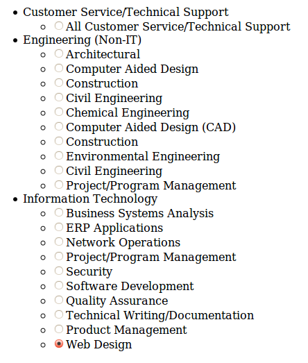
What follows is the beginnings of a chained select progressive enhancement, aka a unobstrusive javascript version. It starts with a nested HTML list. That's the baseline version.

As I mentioned, I decided on an arbitrary prefix for the input values. In this case, the format is categoryID:subcategoryID. You could potentially just post the subcategoryID of course, if your back-end could pull the category automatically.
 <ul class="chained-select chained-select-style">
  <li class="category">
   <label>Customer Service/Technical Support</label>
   <ul class="subcategory">
    <li><input type="radio" name="category" value="1:1">All Customer Service/Technical Support</li>
   </ul>
  </li>
  <li class="category">
   <label>Engineering (Non-IT)</label>
   <ul class="subcategory">
    <li><input type="radio" name="category" value="2:1">Architectural</li>
    <li><input type="radio" name="category" value="2:2">Computer Aided Design</li>
    <li><input type="radio" name="category" value="2:3">Construction</li>
    <li><input type="radio" name="category" value="2:4">Civil Engineering</li>
    <li><input type="radio" name="category" value="2:5">Chemical Engineering</li>
    <li><input type="radio" name="category" value="2:6">Computer Aided Design (CAD)</li>
    <li><input type="radio" name="category" value="2:7">Construction</li>
    <li><input type="radio" name="category" value="2:8">Environmental Engineering</li>
    <li><input type="radio" name="category" value="2:9">Civil Engineering</li>
    <li><input type="radio" name="category" value="2:10">Project/Program Management</li>
   </ul>
  </li>
  <li class="category">
   <label>Information Technology</label>
   <ul class="subcategory">
    <li><input type="radio" name="category" value="3:1">Business Systems Analysis</li>
    <li><input type="radio" name="category" value="3:2">ERP Applications</li>
    <li><input type="radio" name="category" value="3:3">Network Operations</li>
    <li><input type="radio" name="category" value="3:4">Project/Program Management</li>
    <li><input type="radio" name="category" value="3:5">Security</li>
    <li><input type="radio" name="category" value="3:7">Software Development</li>
    <li><input type="radio" name="category" value="3:8">Quality Assurance</li>
    <li><input type="radio" name="category" value="3:9">Technical Writing/Documentation</li>
    <li><input type="radio" name="category" value="3:10">Product Management</li>
    <li><input type="radio" name="category" value="3:11">Web Design</li>
   </ul>
  </li>
 </ul>
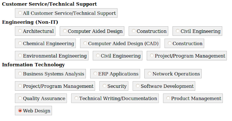
Even the baseline should look decent, however. Here is my basic styling. It also includes some classes which will only be set later by the javascript.
<style>
   #demo { width: 900px; }

   .chained-select-style li { list-style: none; float: left; }
   .chained-select-style li ul li { display: inline; }

   .chained-select-style li.category { font-weight: bold; }
   .chained-select-style .subcategory {font-weight: normal; }
   .chained-select-style li ul li { padding: 5px; margin: 5px; margin-right: 10px; border: 1px solid #B0B0B0; background-color: #F0F0F0; }
   .chained-select-style li ul li.selected { background-color: #F0F0B0; }

</style>
Now, it looks more like this.

The progressive enhancement uses jQuery, and basically just does the following.
- Toggles a "selected" class when an individual item is checked off.
- Hides the category labels and creates a select control with their values.
- Hides the subcategory lists.
- Attaches a behaviour to the new select control to show the relevant subcategory list when the select value changes.
<script>
 $(document).ready(function () {

  function select_changed() {
   if ($(this).is(":checked")) {
    if ($(this).is("[type=radio]"))
     $(this).parents(".chained-select-style").find("li").removeClass("selected");
    $(this).parent().addClass("selected");
   }
   else $(this).parent().removeClass("selected");
  }

  var items = $(".chained-select-style input");
  items.change(select_changed);
  $.each(items.filter(":checked"), select_changed);

  function chained_select(elements) {
   $.each(elements, function () {
    var top = $("<select class='chained-select-top'>");
    $.each($(this).find(".category label"), function () {
     // escape the contents
     top.append($("<option></option>").text($(this).text()));
    });
    $(this).before(top);
   });
   elements.find(".category label").add(elements.find(".subcategory")).hide();
   function chained_select_change() {
    var label_text = $(this).val();
    $.each(elements.find(".category label"), function () {
     if ($(this).text() == label_text) {
      $(this).next().show();
     } else {
      $(this).next().hide();
     }
    });
   }
   var items = $(".chained-select-top");
   items.change(chained_select_change);
   $.each(items, chained_select_change);
  }
  chained_select($(".chained-select"));
 });
</script>
What you end up with is the following. You could certainly take this one step further and convert the subcategory list into the traditional second select control. I just like the way this looks better.

