Designing for the Mental Model
Software is typically more complicated under the hood than it looks on the surface. A good product presents a simple and consistent user interface. Ideally, the implementation is also simple and consistent with the story the UI is telling. But that’s often not possible. If the implementation is complex, if and when that complexity leaks through to the user experience, it will violate the user’s expectations and provide a bad experience.
Mental Models
This user expectation is what I will call their mental model of your product. A good example of a simple mental model, and one that is never violated, is iOS.

Under the hood, there is a more or less traditional operating system with a file system, a multi-tasking process scheduler, even a command line. But you never see these things. Do you even know what a file path on iOS looks like? You don’t, and that’s because the user interface model is inviolate - it never breaks down.
Even when things are not working, the user model holds. You never crash to a command line, or see an error dialog with a file path in it. A task running in the background never crashes and throws an alert on top of your current app.
These behaviors enforce the mental model that there IS nothing underlying the iOS home screen. In some sense, that is the lowest level the user is aware of.
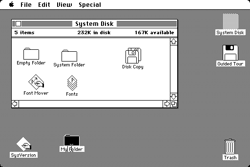
Apple has a history of inviolate mental models. When I started on Macs, the GUI was already the only thing that existed. There was no “there” underneath.

Applications were icons; there was nothing else. You installed and uninstalled them by moving the icon around, or to the trash. There was no other way to make an action happen than to navigate to a menu item; that’s where the platonic form of that action “lived”.
Mental Model Breakdowns
When the user’s mental model is violated, it’s a poor user experience. This often happens with new products especially.
In recent versions of OS X, the Notes app has become a cloud synced system. Apple kind of sucks at cloud stuff; their v1 products especially rarely work smoothly. Yet, they did not go out of their way to prevent the inevitable errors from breaking the user’s mental model.
When you create a note on your Mac, it’s supposed to show up on your phone. What if it does not show up? You don’t know why. Maybe the internet is slow. Most likely it’s an obscure iCloud permissions issues; more and more, “sign out of iCloud and sign back in” is becoming the “did you try rebooting?” of the Mac experience.
In any case, there is no feedback that something went wrong. No status message, no errors, not even a counter of items still being synced. Nothing. When “just works” doesn’t actually work, you have no recourse.
I’m sure some designer somewhere thought this was a great design. Why burden the user with what’s happening behind the scenes? I can just here them saying that this is a bug on the backend, and once that’s fixed their perfect design will once again result in a perfect product. Newsflash - to the user, your design sucks. They are not making the distinction between interface design and implementation. To them, the design is what failed.
The same issues plagued the new photos app on release. You drag photos into a folder. Nothing happens. Did it get my pictures? Not sure. You drag them again. Nothing. Five minutes later, iCloud syncs and you have two copies of your images in the folder. Why isn’t there a status bar or a count of how many items are pending - SOME user feedback when the user makes this fundamental action? Probably because the status bar would be “ugly”. More and more, Apple’s ideal UI is an empty white box.
Now, You Try
If you’re working on products, especially early products, plan to not violate the user’s mental model. Plan for things not working perfectly all the time. When errors do happen, you have two choices:
- Make the internals visible
- Generic/unhelpful error/status messages
Assuming perfect implementation is a bad design - or at least the user would say it’s bad design. Which is a better user experience?
