
This post is a quick start guide for Airtable, focused on use cases of spreadsheets of people. It will cover row level access permissions, Interfaces, scripting, and pivot table dashboards. If you’re coming from Google Sheets, and want to up-level your spreadsheet game for some common manager tasks, this post is for you.
Why use Airtable?
I’m a Google Sheets power user. Even so, I recognize there are some things that are easier or better in Airtable. The sheet itself is prettier. That matters if you’re presenting this content as part of your work! Forms are natively supported, meaning submissions can edit your sheet content directly (and in the format you want) versus feeding into a new sheet. It’s more intuitive to link a bunch of tables together with a foreign key, as opposed to using VLOOKUP. You can control visibility at the row level with Interfaces. Finally, there are more options for data visualization.
That being said, I still turn to Google Sheets when I want to do something quickly, especially if it’s just for me.
Scenario: Calibrations
Calibrations happen during performance review season. It’s a useful example for managers because it’s familiar, and involves the most common data type for managers, people! It also provides natural use cases for forms to collect data, and access control so that other managers only see people they are calibrating on.
Create simple Tables
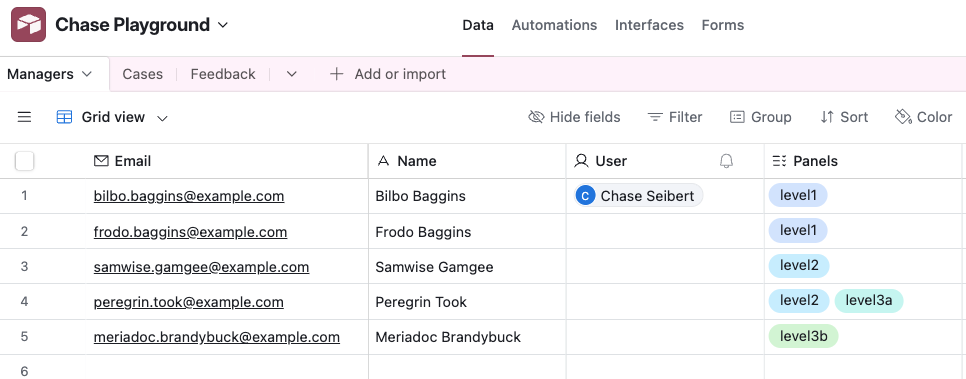
First, create a new Table with a list of managers. You want the first column to be the primary key, meaning it should be unique. Generally email addresses or IDs are better than names, for tables of people.
Add a column to the same Table for calibration panels. These are the names of one or more panels that the manager will review calibration cases for. Use the “Multiple select” column type to normalize the data.
Also add a column with type User to tie to an Airtable user. This will come in handy later.
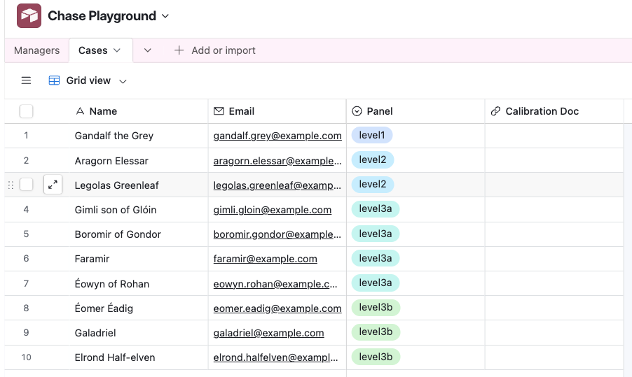
Next, create a list of cases to calibrate on. These rows are people. Each one is assigned to a cohort. Note that this Panel column is a new “Single select” column, which must have the same options as the column in the Managers Table. Alternatively, you can create a normalized Table just for panels, and link both Managers and Cases to those.
I’ve also added a blank column for the link to the calibration document.
Create an Interface
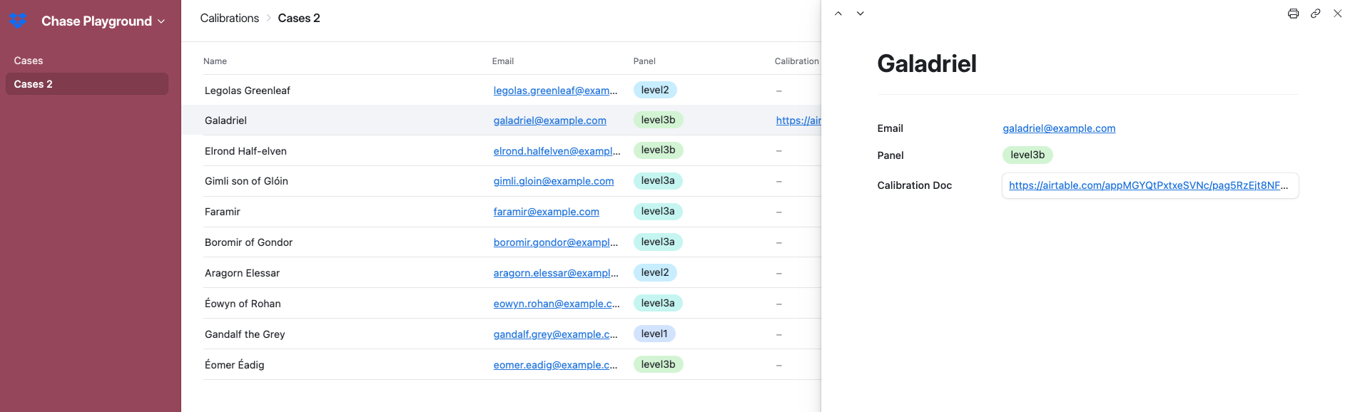
Ok, now we get to create a view for managers to enter the link to the calibration document for their cases.
Create an Interface called “Calibrations”. Make it type “List”, and point it to the Table of cases. To start, this just gives you back the full list of cases. Notice that it’s not editable by default. To make it editable, go back to the data view, click on the Table name, and select “Edit table permissions”.
Now, go back to editing the Interface, select the field Calibration Doc, and make it editable. Make the other fields view only. Note that some field types are editable in the list view itself, and some are not. The URL type is not editable in the list view; users need to open the record and edit it in the preview.
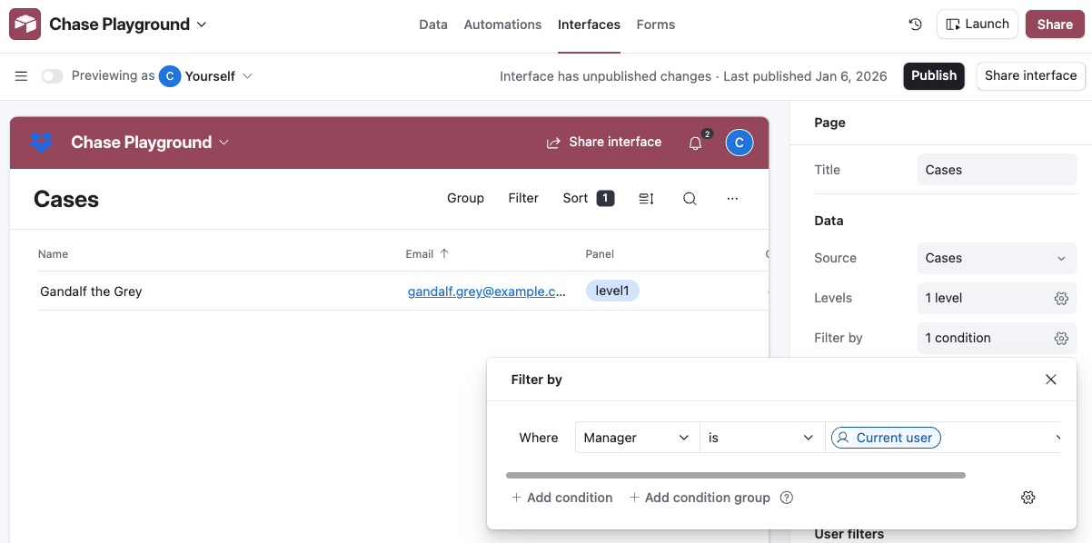
Filter to the current user
Notice that users can filter this view. For example, they can filter down to rows that they are the manager for. What if you wanted to make this the default for this Interface?
First, we need rows to be associated with an Airtable User record, not just the name of the manager. Go back to the Cases Table, and add a column of type User. You need to manually select the right User for each row.
Now edit the Interface again, and you can define a default filter for the Manager to be “Current User”.
Calibration Feedback
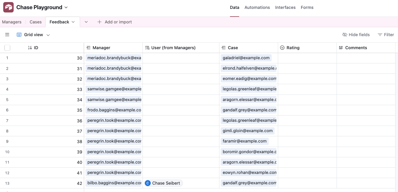
Now, we are going to add a Table and an Interface to collect calibration feedback from panel members on every case in that panel. We’re going to work backwards from what we want, which is a Table where each row is feedback from a manager on a specific case. There will be multiple rows in this Table from any given manager.
Create a Table “Feedback”, with columns:
- Primary Key: ID (type Autonumber)
- Manager (type Link to Managers)
- Case (type Link to Cases)
- Rating
- Comments
These should not allow linking to multiple records, just one record. But, how can we populate this Table with one row for every combination of case and panelist for that case?
Scripting
Create an Automation where when you press a Button, it runs a script. I wish the Airtable AI supported helping you write this code, but here is what I came up with using ChatGPT and some iteration.
Warning: this script deletes all existing Feedback records.
let managers = base.getTable("Managers");
let cases = base.getTable("Cases");
let feedback = base.getTable("Feedback");

// delete all feedback records; you could also do this manually instead
let query = await feedback.selectRecordsAsync();
let recordIds = query.records.map(r => r.id);
while (recordIds.length > 0) {
    await feedback.deleteRecordsAsync(recordIds.slice(0, 50));
    recordIds = recordIds.slice(50);
}

let allManagers = await managers.selectRecordsAsync({fields: managers.fields});
for (let manager of allManagers.records) {

    if (!manager.getCellValue("Panels")) continue;
    let managerPanels = manager.getCellValue("Panels");

    let allCases = await cases.selectRecordsAsync({fields: cases.fields});
    for (let thisCase of allCases.records) {

        if (!thisCase.getCellValue("Panel")) continue;

        let casePanelName = thisCase.getCellValue("Panel").name;
        if (managerPanels.some(
                panel => panel.name === casePanelName
            )
        ) {
            console.log("Creating empty Feedback record:", {
                manager: manager.getCellValue("Name"),
                caseName: thisCase.getCellValue("Name"),
                panel: thisCase.getCellValue("Panel").name,
            });

            await feedback.createRecordAsync({
                "Manager": [{ id: manager.id }],
                "Case": [{ id: thisCase.id }],
            });

        }
    }
}
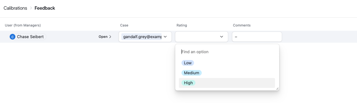
You don’t have to attach this automation to anything. Instead, you can come back to this Automation tab anytime, and run the automation manually.
Running it will yield something like this:
Using our techniques before, it’s simple to add a second Interface to expose just the Feedback rows for the currently logged-in user.
Analysis & Dashboards
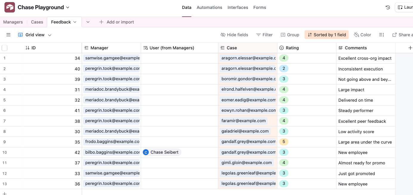
In order to build an example of analyzing the feedback results, first fabricate some dummy data.
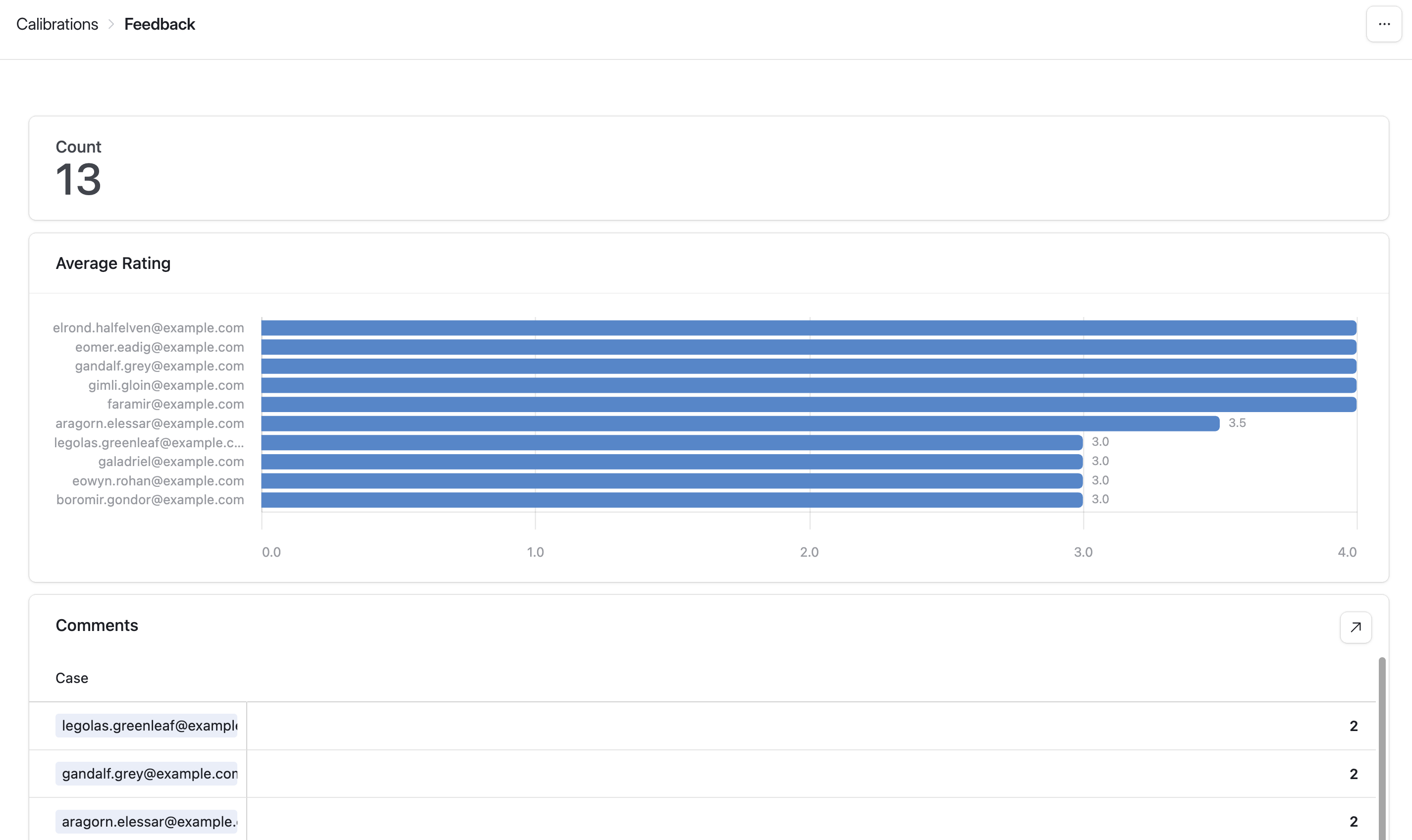
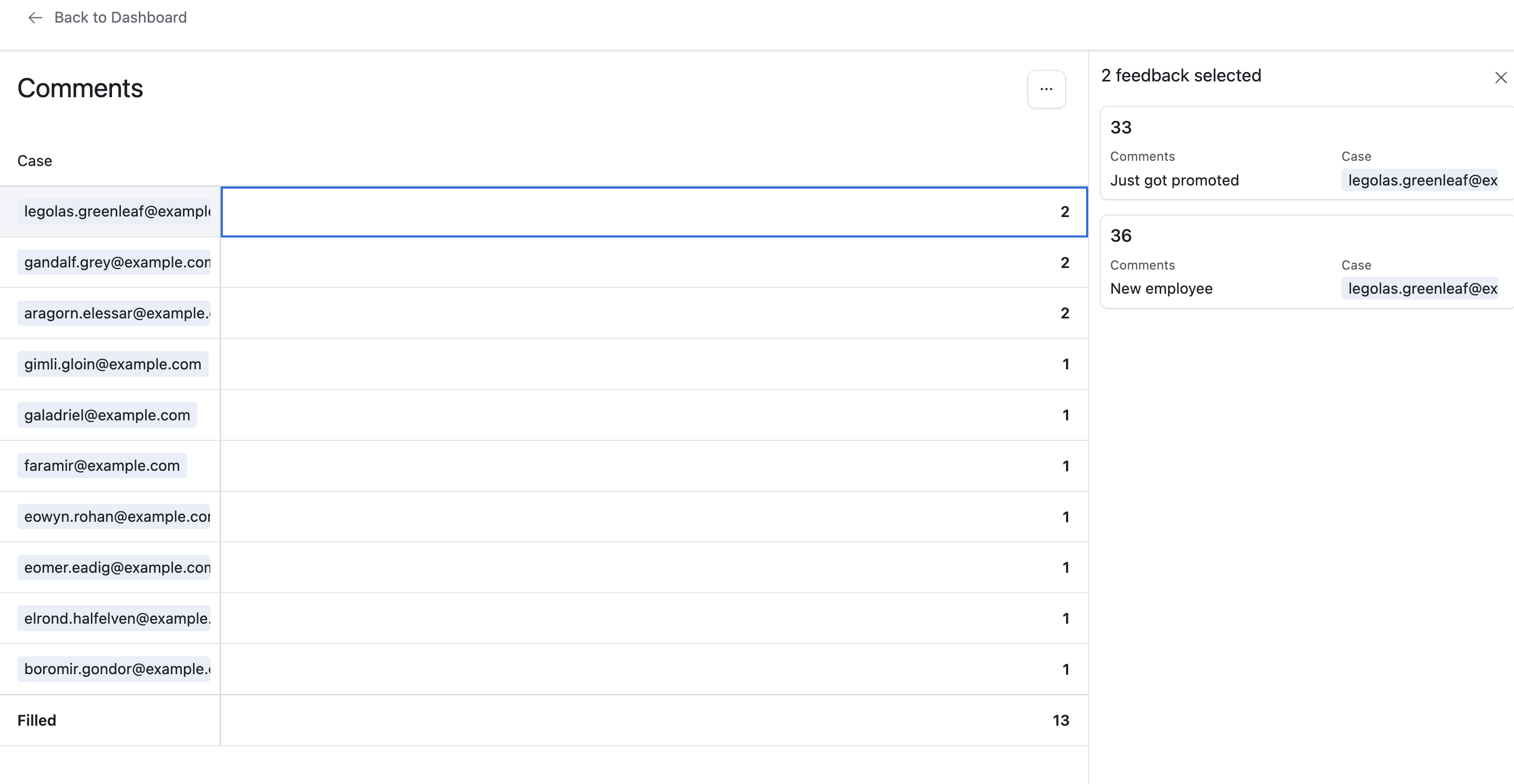
Now, we need to aggregate ratings and comments per case. You can do this by creating a new Interface using the type “Dashboard” based on the Feedback Table. Once inside the Interface builder, select the option to add a “Pivot Table”.
It’s straightforward to create both a bar chart of average rating per case. You can also create a list of counts of comments, where the user can click into each case to view the various comment text.
Exporting to Google Sheets
The Airtable pivot table and list views are limited. Compared to Google Sheets pivot tables, they are missing one piece of critical functionality. That’s the ability to have multiple value columns in a pivot table. That enables you to do things like have one table with the average rating, the count of ratings and even the concatenated comments.
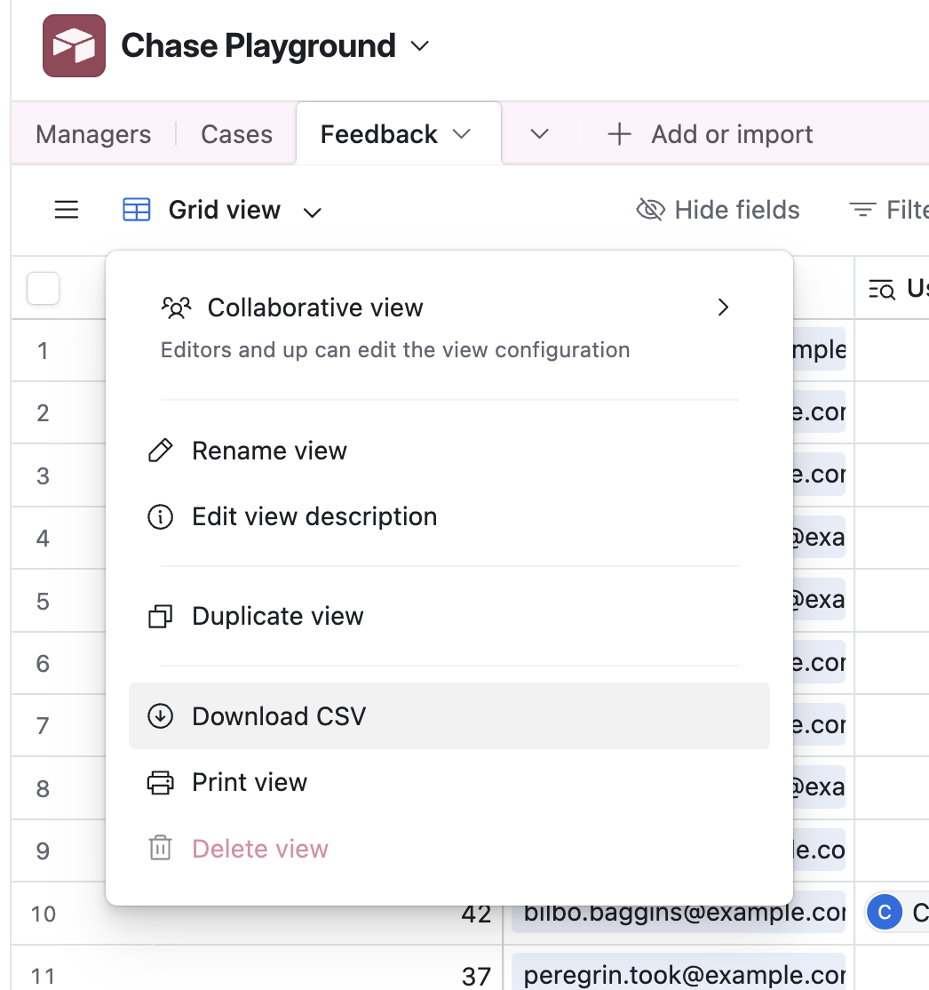
It’s easy to export one or more Airtable Tables to Google Sheets. For a small Table, you can simply select all the rows in the data view, and copy and paste into Google Sheets. You can also download to CSV from Airtable. Finally, there are third party extensions that can sync live to Google Sheets, though I would not recommend that.
Conclusion
Airtable is basically a database builder that also lets you build mini applications on top. It excels at having tables with enforced data type schemas, defined relationships between tables, and defining Interfaces to both enter and report on data.
Google Sheets excels at manipulating data, and also analyzing data.
You can easily combine the two tools, and leverage the strengths of each one. My recommendation is to use Airtable for gathering data in a consistent format with easy to use interfaces, and then export the results to Google Sheets if you need to do serious analysis.